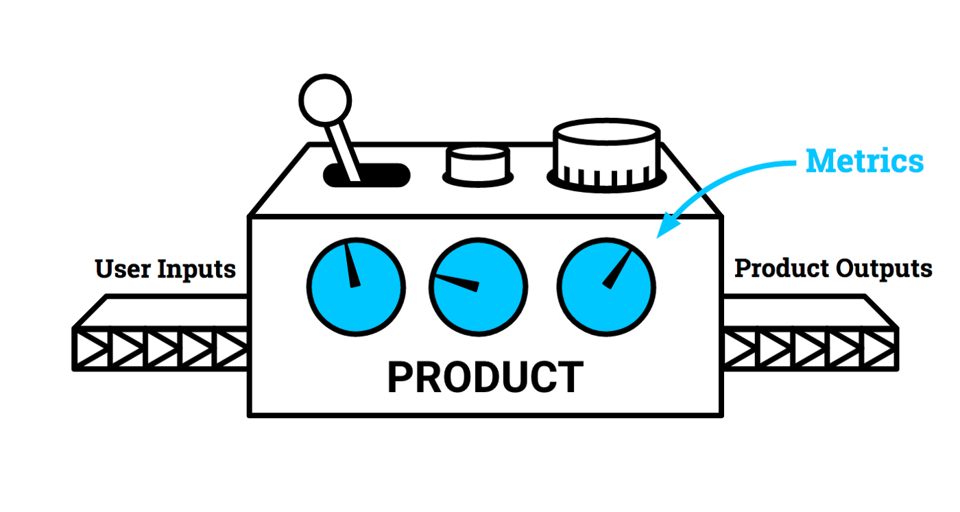
major metrics that matter the most for almost all product people
1.MAUs / DAUs
Monthly Active Users (MAU) and Daily Active Users (DAU) are a great overview of a digital product’s overall health. If you’re thinking about your long-term growth, these are metrics which you can’t afford to miss! They help to track whether your user base is growing or not, and how ‘sticky’ your product is for end-users.
Determining what a DAU is will depend entirely on your product. It’s very rarely as simple as someone who just opens the app and then closes it again. What many product people try to do is determine a minimum action taken to get value from a product. For a music streaming service, for example, this might be playing a song. For a messaging app it might be sending one message.
Similarly, how often someone needs to use your product to qualify as an MAU will also vary depending on your offering. Do they need to use it once a month, or twenty times a month, to qualify?
Setting the bar too high can be just as disastrous as setting the bar too low. The question you need to ask yourself is, ‘ how am I providing value for the end-user?’ and base your metrics off of that.
2. Customer Conversion Rate
How many people who land on your website or app do what you want them to do? Whether that’s signing up for the freemium version of your new tool, uploading their photos, or streaming your content. A low Customer Conversion Rate shows that people are landing on your app/website, and not really finding what they’re expecting, or they’re disappointed.
Why does this matter? For starters, it helps you identify key drop-off points for users and features which may not be working. Sure, they may find their way to your new feature, but if they’re not using it it’s hard to imagine what value it’s providing them with.
Equally, if you find that only a small percentage of your users find your new feature, but the conversion rate is very high, you know that the fault is not with the feature itself, but discoverability. Instead of scrapping the feature, go over your user on-boarding process to help more people find it.
3. Churn & Customer Retention Rate
You know the drill by now…what counts as churn will depend on your product!
Customers are great, and getting new customers every day looks great on the growth charts. But if those customers are dropping off after only a few days (or in the fickle world of apps, a few seconds!) then you’ve essentially got a leaky bucket instead of a product. There’s no point filling the bucket with new users unless you can keep them. What you want is a high Customer Retention Rate, where more people come back than disappear forever.
As Airbnb Growth Product Manager says, companies that haven’t understood retention, and stepped on the gas too fast with their acquisition, have then lost all of their users very quickly. Without users, your product is nothing.
If you have a high churn rate, it means that your product isn’t delivering what it promises. On the other hand, a low churn rate shows that your user base is loyal, and like your product at least enough to stick with it.
Don’t forget that not all churn is bad! For example, dating apps like Badoo and Tinder are sometimes uninstalled because they’ve served their purpose, and the users are now in relationships. Not all products are designed to be used for the rest of their user’s lives! Perhaps you have a job searching tool, which users would be inclined to uninstall when they land their dream job. Churn rate alone can’t give you the whole story, which is why you need…
4. NPS & CSAT Score
Net Promoter Score (NPS) and Customer Satisfaction Score (CSAT) are great ways to measure the sentiments of your users.
Your NPS score, in a nutshell, tells you how well your product is loved by users. It helps you segment your users into 3 categories based on how they rate your product out of 10.
- 1–6 = Detractors: These people use your product, but only out of necessity/lack of alternative, and wouldn’t recommend it to a friend.
- 7–8 = Passives: These people like your product, but you haven’t delighted them.
- 9–10 = Promoters: These people are gold dust. They’re your number one fans and will actively promote your product within their circles.
Once you have your promoters, you can leverage them in your product-led growth strategy, and in your marketing.
CSAT is a more simple score, and can be used to measure how happy users are with individual processes and features. While NPS is more often used to measure how happy customers are with the entire user journey, CSAT allows you to be more specific. For example, you can ask users to score your onboarding experience out of ten, once they’ve finished the tutorial. It’s a one-tap survey which is a common feedback collection method within customer service.
